Types of Data Visualization – The Most Common Charts, Graphs, Formats & Tools

Chart Types, Format Types, & Tool Types

Charts and Graphs, Formats and Tools

Which Type of Data Visualization Are You Interested in Learning About?

In this article, let’s look at the different types of data visualization.

What charts are out there in the world? What formats are used in modern data visualization? What types of tools and software do you use for data visualization?

I wanted to know the answer when I started designing data. And this industry is always changing, year after year. So we’ve refreshed our view on the different chart types we think you should know about. We’ve expanded into the different formats data visualization is viewed and experienced. And finally, if you’re interested in “how-to” visualize data, click on the button below to peek inside the types of data visualization tools you want to be aware of in 2022.

So which type of data visualization are you curious about today?

Types of Data Visualization Charts and Graphs

There's so many charts and graphs! Let's keep it simple — below are 15 chart types you should be interested in.

With the growing amount and accessibility of data, knowledge about the types of data visualization is becoming increasingly important. According to the writers of A Tour Through the Visualization Zoo, “The goal of visualization is to aid our understanding of data by leveraging the human visual system’s highly-tuned ability to see patterns, spot trends, and identify outliers.”


In general, there are two different types of data visualization: exploration, which helps find a story the data is telling you, and an explanation, which tells a story to an audience. Both types of data visualization must take into account the audience’s expectations. Within these two basic categories, there are many different ways data can be made visual. In this article, we’ll go through the 15 most common types of data visualization that fall under the 2D area, temporal, multidimensional, hierarchical, and network categories.

Multidimensional Chart Types

Multidimensional data elements are those with two or more dimensions. As you'll see below, this category is home to many of the most common types of charts and graphs.
Donut chart, a type of data visualization

Pie chart

A pie or circle chart is divided into sectors to illustrate numerical proportion; the arc length and angle of each sector are proportional to the quantity it represents.

Histogram

A histogram is a data visualization that uses rectangles with the heights proportional to the count and the widths equal to the “bin size” or range of small intervals.
Example of a histogram, one of the different chart types in this list
A scatter plot with multiple data points visualized

Scatter Plot

A scatter plot displays values for two variables for a set of data as a collection of points.

Temporal Visualizations

Temporal visualizations are similar to one-dimensional linear visualizations but differ because they have a start and finish time and items that may overlap each other.
This is a connected scttare plot, an example of a data visualization chart

Connected Scatter Plot

A connected scatter plot is a scatter plot, a plot that displays values of two variables for a set of data, with an added line that connects the data series.

Polar Area Diagram

A polar area diagram is similar to a traditional pie chart, but sectors differ in how far they extend from the center of the circle rather than by the size of their angles.
A nightingale chart, a type of more advanced data visualization chart type
A time series chart from our compendium of chart types

Time Series

A time series is a sequence of data points typically consisting of successive measurements made over a time interval, such as the number of website visits over a period of several months.

2D Area Visualizations

2D area types of data visualization are usually geospatial, meaning that they relate to the relative position of things on the earth’s surface.
A cartogram of the United States, showing data on a representational map

Cartogram

A cartogram distorts the geometry or space of a map to convey the information of an alternative variable, such as population or travel time. The two main types are area and distance cartograms.

Choropleth

A choropleth is a map with areas patterned or shaded to represent the measurement of a statistical variable, such as most visited websites per country or population density by state.
Choropleth map of Australia, a data visualisation chart type
A map type used in data visualisation, a dot distribution map

Dot Distribution Map

A dot distribution or dot density map uses a dot symbol to show the presence of a feature on a map, relying on visual scatter to show spatial patterns.

Hierarchical Charts

Hierarchical data sets are orderings of groups in which larger groups encompass sets of smaller groups.
A graphical representation of a dendrogram diagram used in data visualization

Dendogram

A dendrogram is a tree diagram used to illustrate an arrangement of clusters produced by hierarchical clustering.

Ring Chart

A ring or sunburst chart is a multilevel pie chart that visualizes hierarchical data with concentric circles.
Color applied to a sunburst or ring chart, an advanced type of data visualization graphic
Tree diagram graphic from our types of data visualization charts list

Tree Diagram

A tree diagram or tree structure represents the hierarchical nature of a structure in graph form. It can be visually represented from top to bottom or left to right.

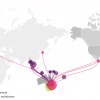
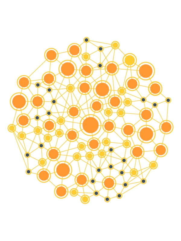
Network Visualizations

Network data visualizations show how data sets are related to one another within a network.
Alluvial-Diagram-Type-of-Data-Visualization-01

Alluvial Diagram

An alluvial diagram is a type of flow diagram that represents changes in network structure over time.

Node-Link Diagram

A node-link diagram represents nodes as dots and links as line segments to show how a data set is connected.
Example of a nodes and link diagram, a network type of visualization
A matrix chart shown as a table of colored data

Matrix Chart

A matrix chart or diagram shows the relationship between two, three, or four groups of information and gives information about said relationship.
Types of data visualization charts:Pie chartBar graphSankey diagran

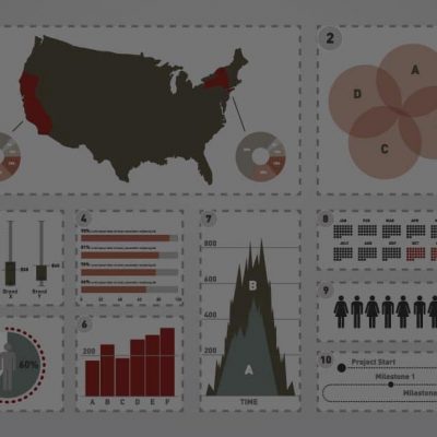
Types of Data Visualization Formats

Here are the five most important data visualization formats you should know about.

Here we’ll look at the top 5 formats there are in data visualization. Number 6 will eventually become holograms. But until that day comes, let’s stay realistic and look at 5 of the most common format types: infographic reports, digital dashboards, data presentations, interactive data visualizations, and animated data videos.

Flat, Interactive, & Motion Formats

People like to see data in different ways. We've curated a list of these 5 types of data visualization types we see in the world.
An icon of an infographic report, a different type of data viz

Infographic Report

A fusion of infographics, magazine-like layouts, and long-form typography. Think of an infographic report as the child of a beautiful infographic and a well-designed article.

Dashboard

A dashboard is a graphical display and business intelligence tool that allows users to analyze, discover and report on current values or changes in data.
Icon showing a dashboard, a type of data visualization format
Icon of a data presentation, a slide of map

Data Presentation

Data presentations are graphics, text, icons, charts, and diagrams displayed on slides, typically using PowerPoint.

Interactive Data Visualization

Interactive data visualizations are a newer format for analysis and storytelling. Data and information are coded, often in JavaScript, HTML, and CSS and are experienced through a web browser.
Icon of an interactive map from the list of data visualization format types
Icon of a motion graphic or animated data video on a tablet

Animated Data Videos

Animated data involves the cinematic display of metrics, statistics, and relationships in a linear story. Often designed in After Effects (see below in Tools section), these videos can tell complex stories with multiple scenes and dimensions (eg. 3d).
Types of data visualization formats:Infographic reports (pdf, jpg, png, gif)Dashboards (pbix, tbwx, +)Data presentations (ppt)Interactive data visualizations (javascript, html, css,+)Animated data videos (aep, mov, mp4, +)

Types of Data Visualization Tools

Interested in data visualization and want to know what tools we recommend?

There’s a glut of data visualization tools out in the market today. But really we at the Datalabs Agency use these five (and we code when we’re designing an interactive experience). So if you’re interested in learning about data visualization tools, you couldn’t go wrong with discovering more about Adobe Illustrator & After Effects, Tableau, Microsoft’s Power BI, PowerPoint, and yes, the ubiquitous Excel.

Types of Tools and Software for Data Visualization

Here's a list of 5 of the most important types of data visualization tools (for good and for bad).
Tableau logo, software used for data dashboard design

Tableau

Tableau is the Coca Cola or Pepsi of data visualization tools. It's dashboard design software. Use it to make charts, create full dashboards, and interact with a user using clicks, drop-downs, buttons, etc.

Adobe Illustrator

Adobe Illustrator is the Godfather of infographics. It's the software most professional designers use for creating infographics. It's data-driven chart capabilities, however, make it difficult to use for data visualization, however.
Logo for Adobe Illustrator, the main software for designing infographics
Power BI's logo, software for designing the format of dashboards

Power BI

Microsoft's Power BI software is a great dashboard creator. Along with Tableau (mentioned above), Power BI is the Coke or Pepsi in the world of data visualization tools. Free for most casual users.

Microsoft Excel & PowerPoint

Excel and PowerPoint are still used for data visualization. These tools have come a long way, and they retain their usefulness in designing and presenting data. Here's a tip: Distrust the default designs. And make your own data design style.
Logo for Microsoft Excel, still a great visualizer of data
Logo for Adobe After Effects, a motion graphics creator and data viz tool

Adobe After Effects

After Effects is a recent addition to this list of data visualization tools. This animation software has a powerful plug-in ecosystem that allows for the ingest of data and numerous templates to make professional motion graphics.
Types of data visualization tools and software:Tableau (for dashboards)Adobe Illustrator (for infographics)Power BI (for dashboards)Microsoft Excel & PowerPoint (for data presentations)Adobe After Effects (for animated data)

About This List of the Different Data Visualization Types

A comprehensive list is like a bonsai garden — it must be tended.

When and where data visualization evolves, so will our visual compendium of data visualization types.

This is our data visualization agency’s view of the different types of data visualization charts, formats, and tools. Obviously, the list could be near-infinite. So just like the universe, we’ll be expanding it.

From the dreaded pie chart to the often-misunderstood Sankey diagram, we’ll geek out on more data viz guidance, placing even newer content to this list of categories and types.

So bookmark this page and sign up for our data visualization newsletter to keep your data design brain well-fed.

Data agency image of a radar chart, street art

Intro to Data Viz & Storytelling Workshop

Learn the fundamentals and advance to the next level.

Image

Designing Great Dashboards Course

Learn a better way to design dashboards, no matter the software.

A data agency's brand guidelines for charts and graphs

Data Visualization & Storytelling Course

Learn to visualize data & stories at your own pace.

Data agency consultants image of a thinking brain

Interested in Working with Us?

Pick our brain, let us know what you're looking for.

Datalabs